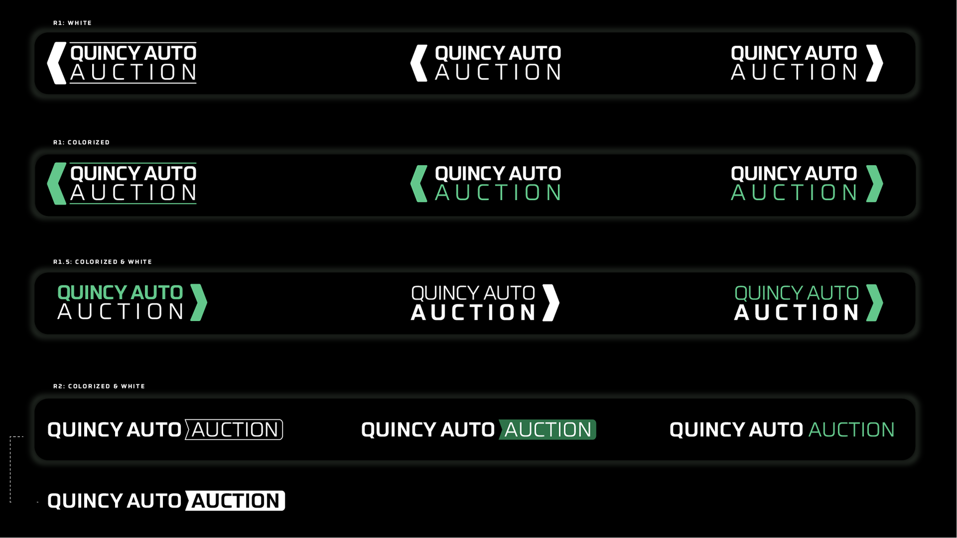
R1 - Color influence from parent company, though moved to stick with their red in R2.
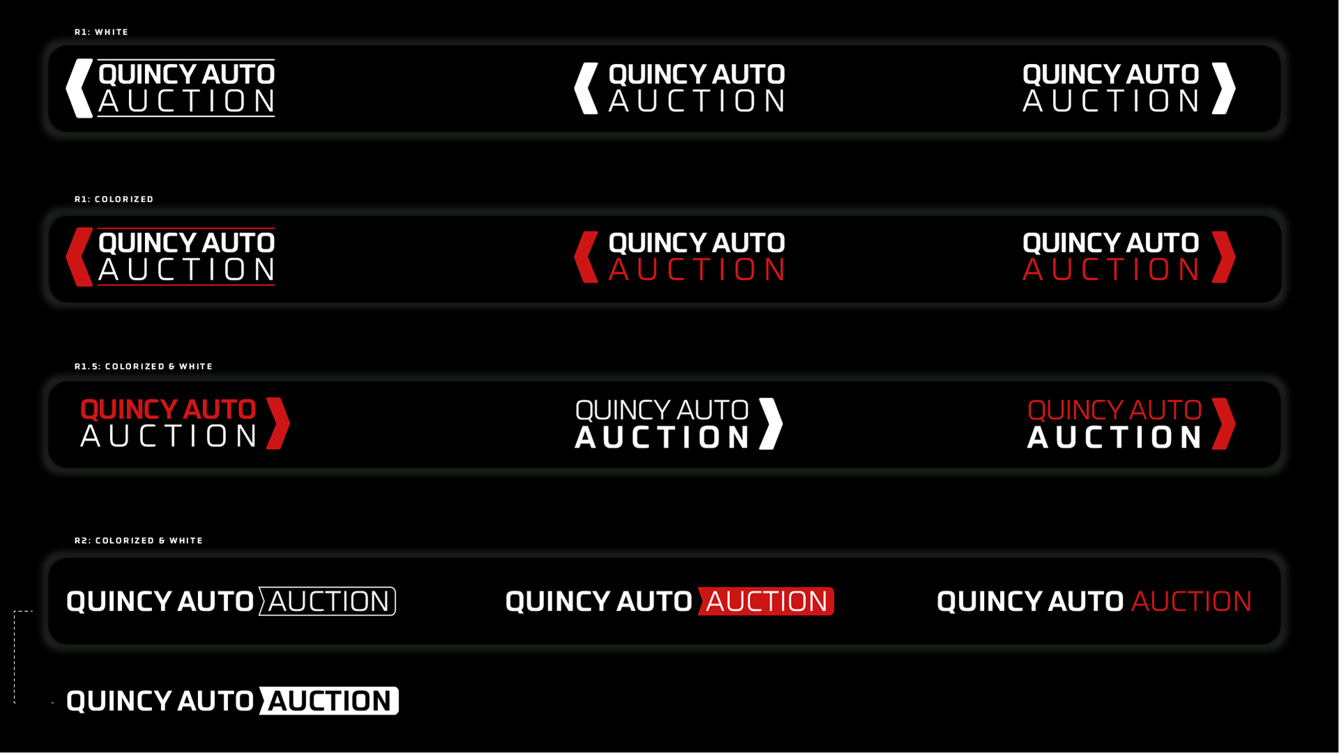
R2 - Color iteration shift.
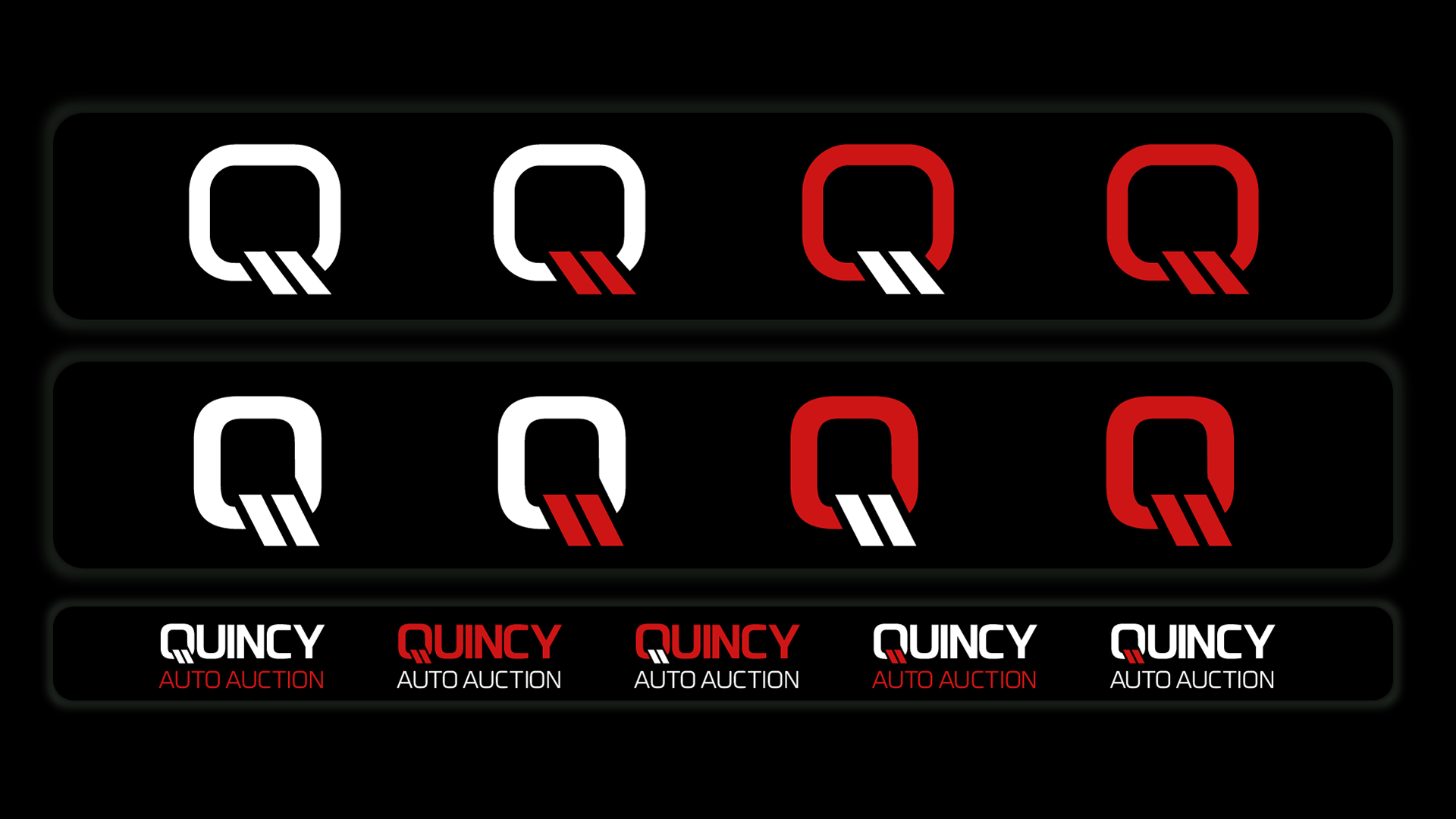
R2 - Lettermark exploration and lock-ups.
R2 - Further lettermark exploration, color palette testing, and further lock-ups with lettermark logo.
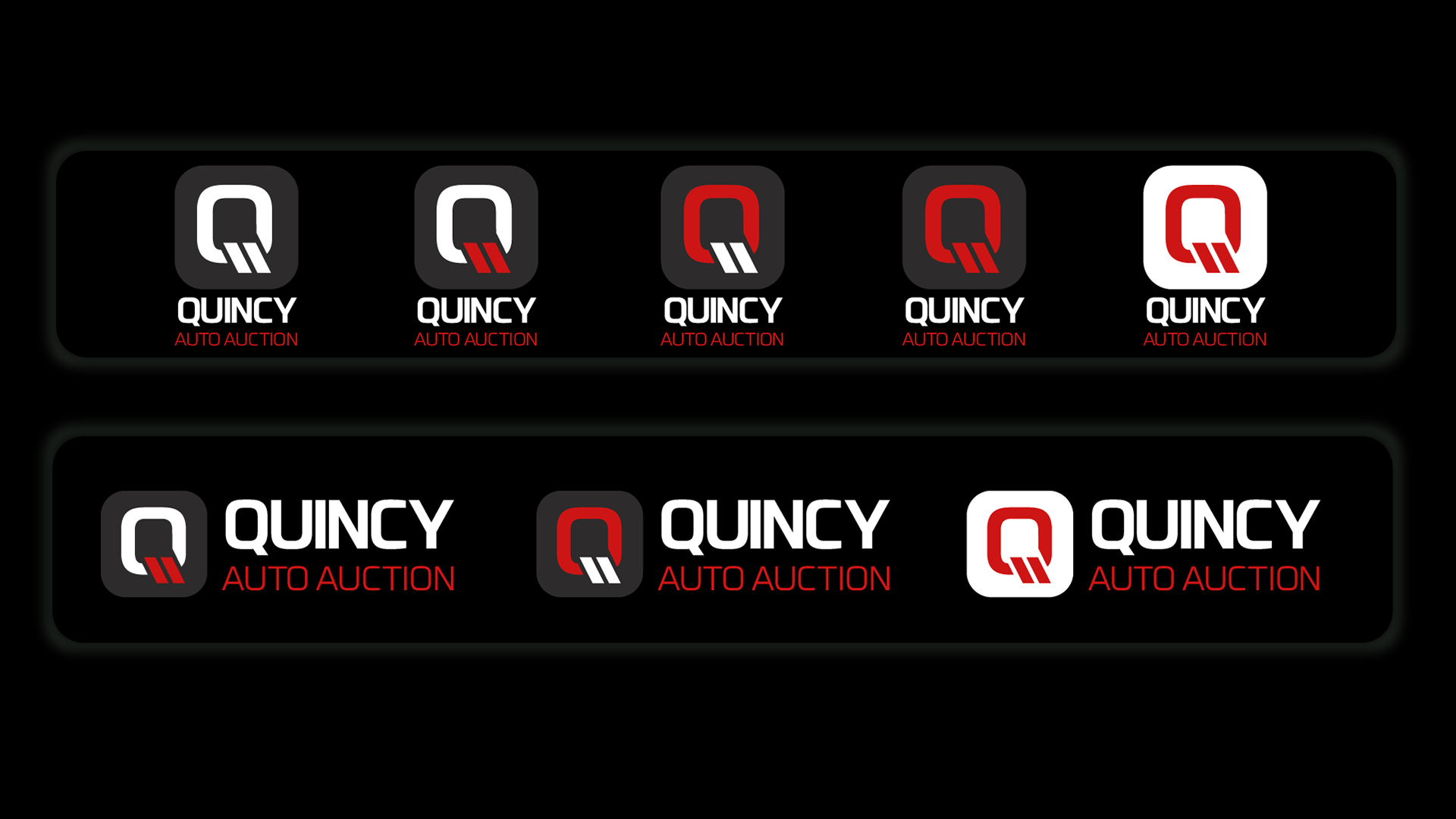
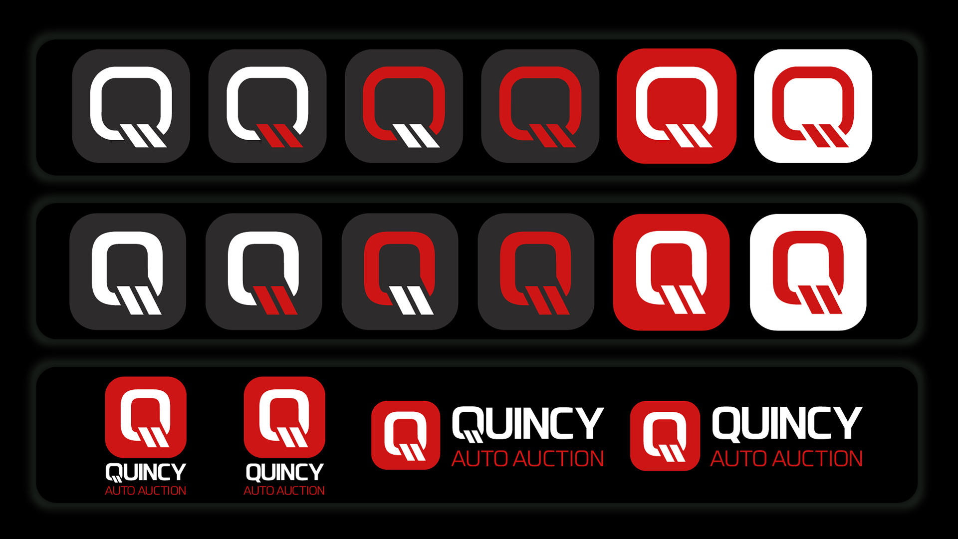
R2 - Further exploration of the icon and how it arranges itself with type.
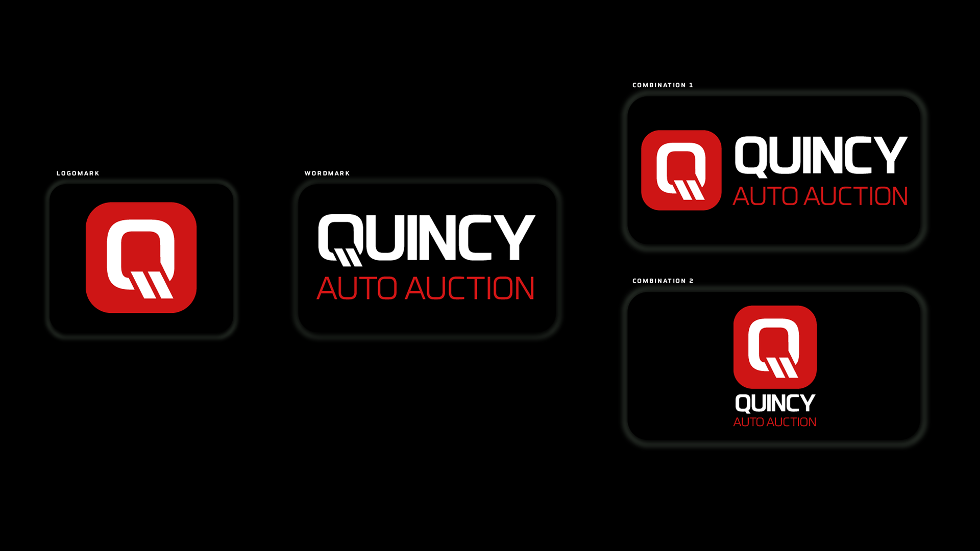
Final - Approved primary logos and their alternative lock-ups.
Mentioned by the client, the primary logomark (in Futo Sans) would be utilized most on dark backgrounds, therefore allowing for the exploration to take place with those requests in mind.
Secondary, tertiary, and B&W palettes accompany this deliverable with varying lock-ups in RGB and CMYK palettes for variety of application.
Secondary, tertiary, and B&W palettes accompany this deliverable with varying lock-ups in RGB and CMYK palettes for variety of application.
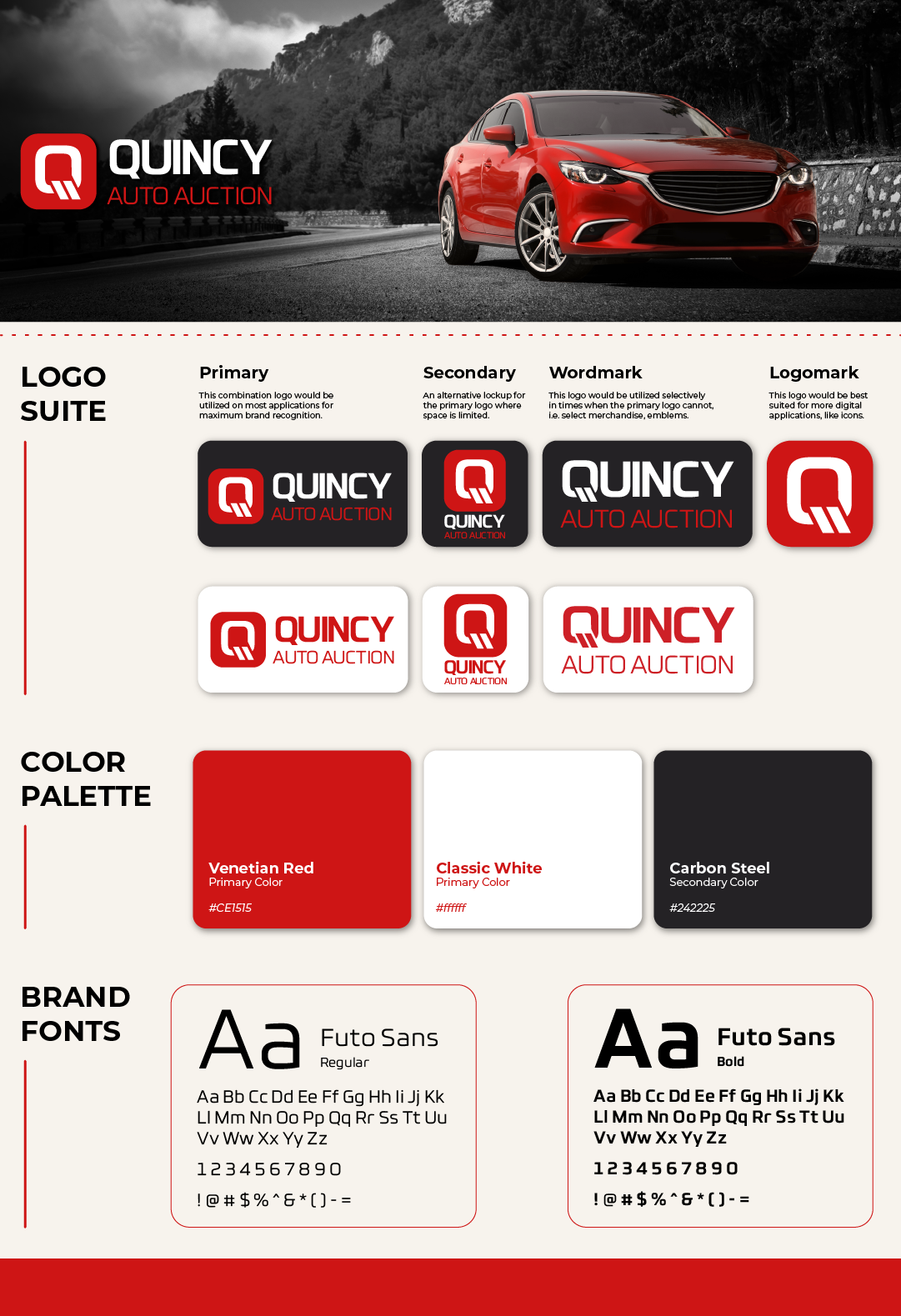
Digestible brand guideline brief for the company's corporate team, managers, and sales teams alike for ease of updated application.
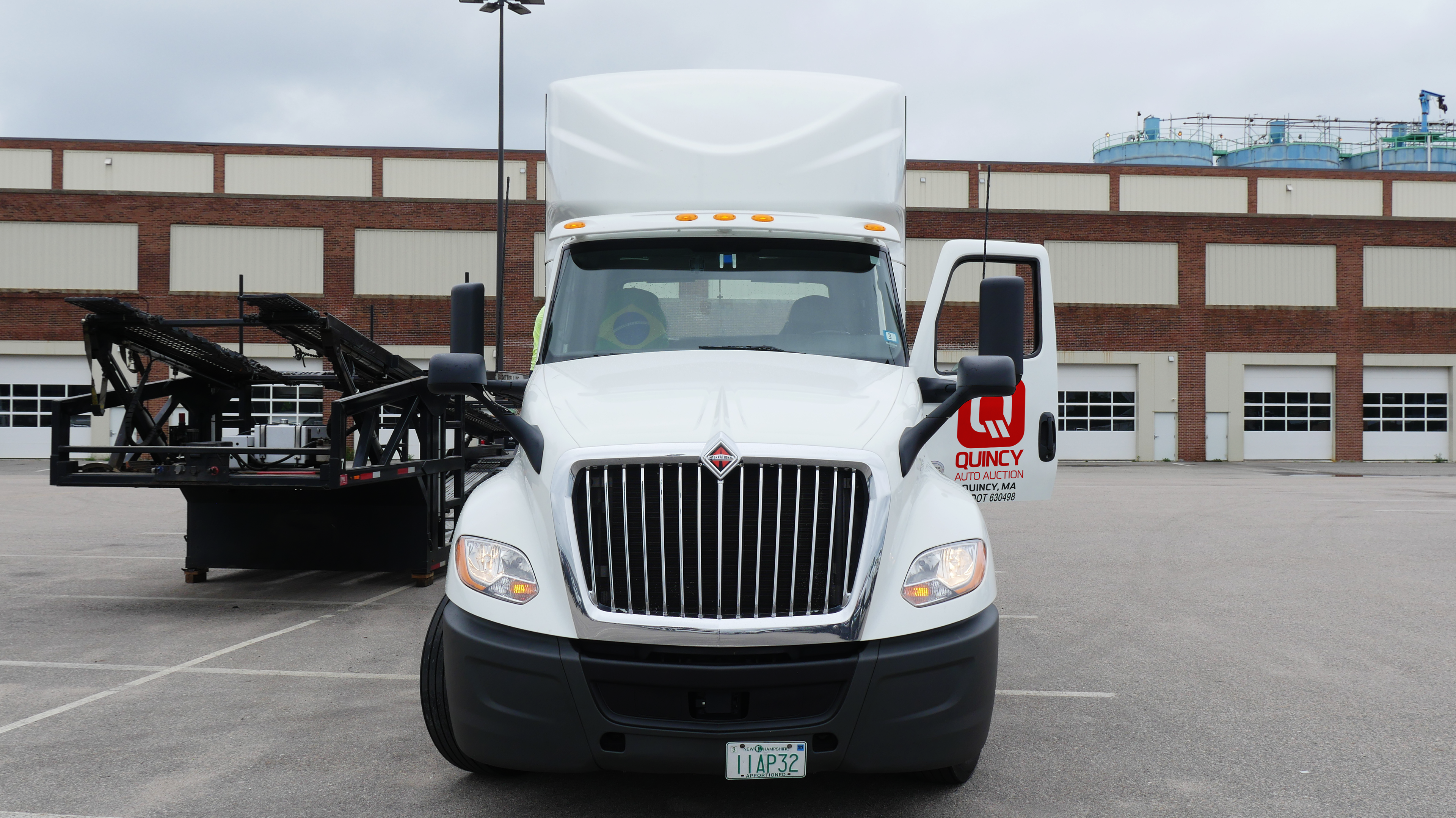
Trucks.
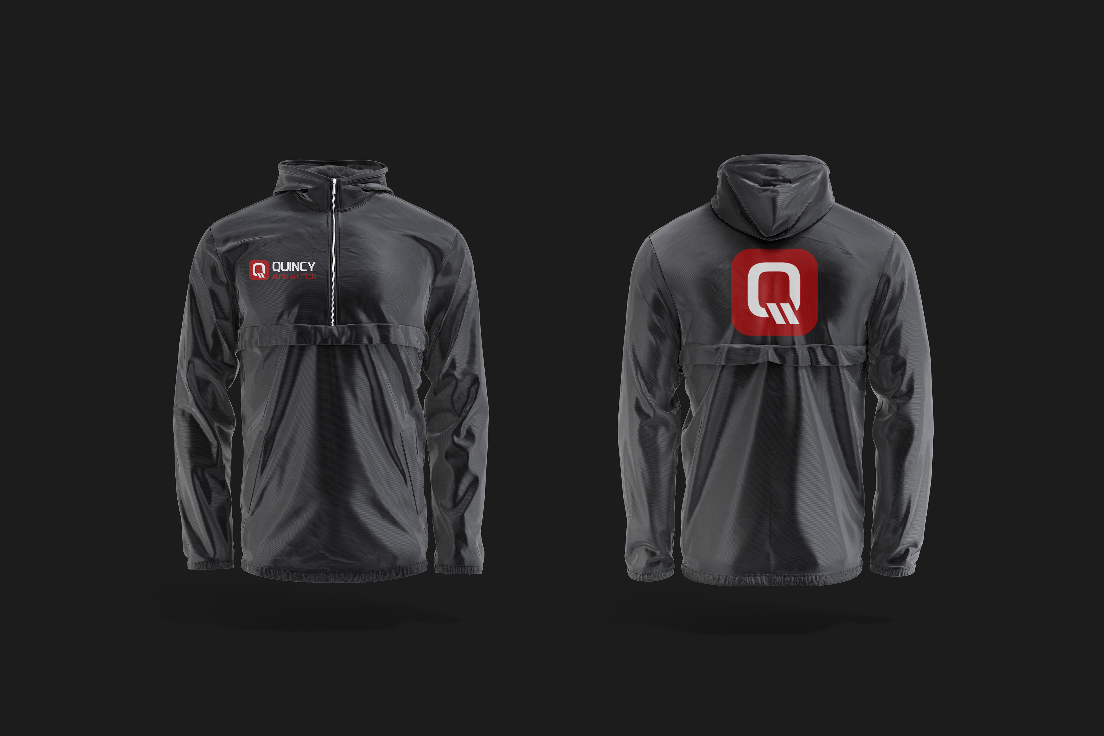
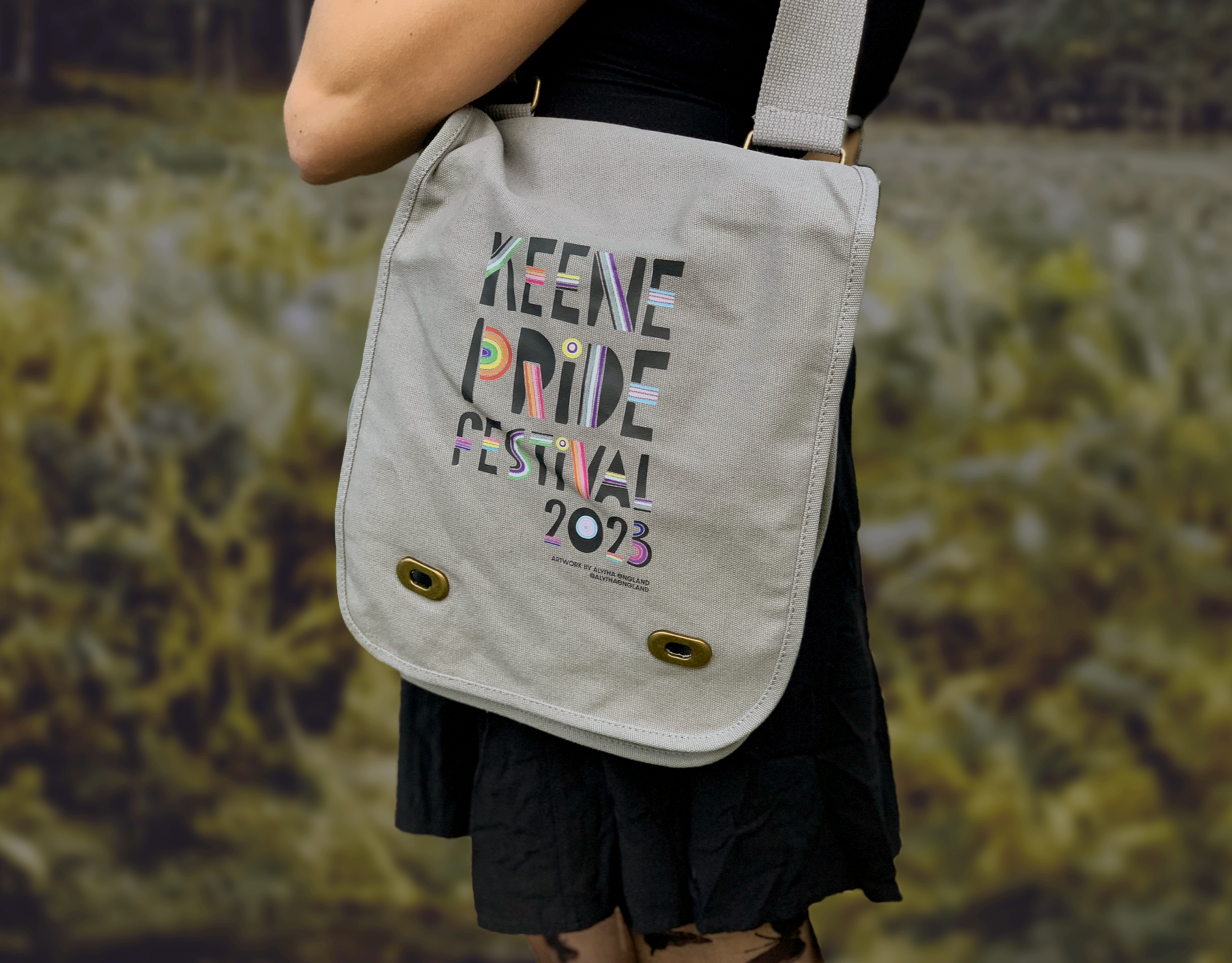
Merchandise.
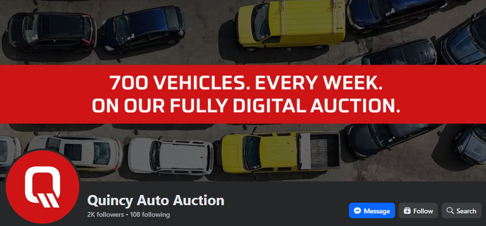
Facebook.
LinkedIn.